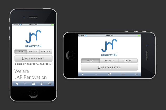
I’ve spent the last few days mostly figuring out media queries for the age of Responsive Web Design. For a long time I’ve stayed away from elastic- or liquid-layouts because they seem more hassle than they’re worth, not to mention I’ve never seen a nice typographical outcome in any situation that I’ve seen them at work.
With JAR Renovation‘s website I will be building my first website designed to shift content depending on the screen size. Not only do I believe in a ‘one web’, but mobile stylesheets intimidate me. To have the help of Andy Clarke’s 320 and Up has helped me find the best way to tackle the issue of smaller-screened-web-devices.
Just building that navigation bar was challenge enough, so I’m excited to have the opportunity to learn these new ways. I hope to share more, perhaps even some tips, as I come across the problems I solve; providing I solve them successfully!
